
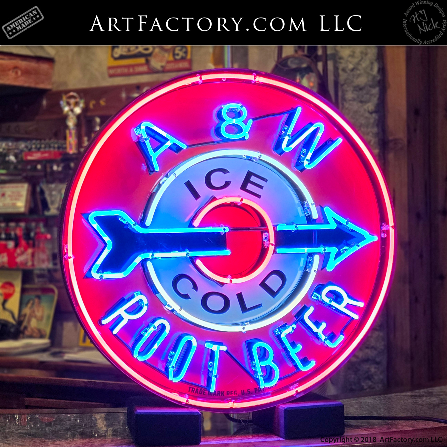
A&W Root Beer 30″ Neon – NS1255
The A&W Bullseye Arrow is more than a corporate logo; it is an architectural landmark of the American roadside. To understand its significance, one must look at the intersection of post-war car culture and the evolution of the modern franchise.

Description
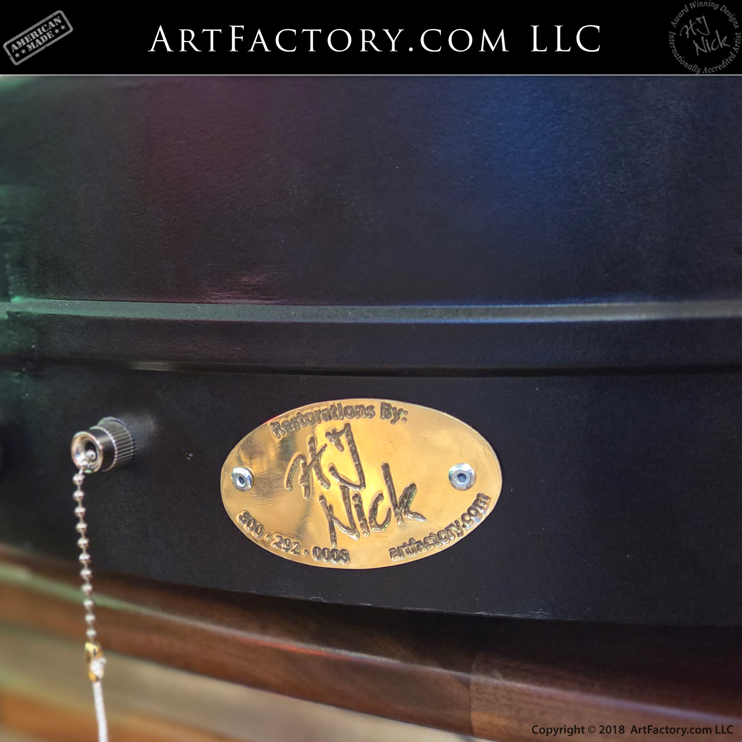
The Story: Salvation
in the Mojave
The radiator had been screaming since Barstow, a rhythmic, metallic hiss that soundtracked a journey through purgatory. By the time the wheels crossed into Arizona, Route 66 had stopped being a road and started being an enemy. It was a living thing — indifferent, sun-bleached, and cruel.
The heat didn't just sit in the air; it rose through the floorboards, baking the soles of boots and turning every breath into a lungful of fine, alkaline dust. Back near Needles, the last shred of optimism had rattled loose and vanished in the rearview mirror along with the fuel gauge’s needle. Every mile of that cracked asphalt felt like a tax on the soul.
Specifications
A&W Root Beer Bullseye Arrow Neon Sign Information
- Era: Late 1950s to mid-1960s
- Licensed by: A&W Corporate
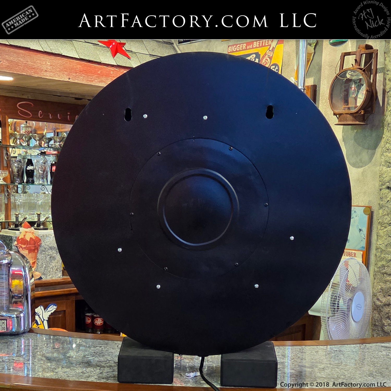
- Diameter: 30" In.
- Depth: 6-9" In.
- Weight: 33 lbs.
- Surface Material: Porcelain steel face
- Colors: Red field, Blue lettering and Red/Blue arrow
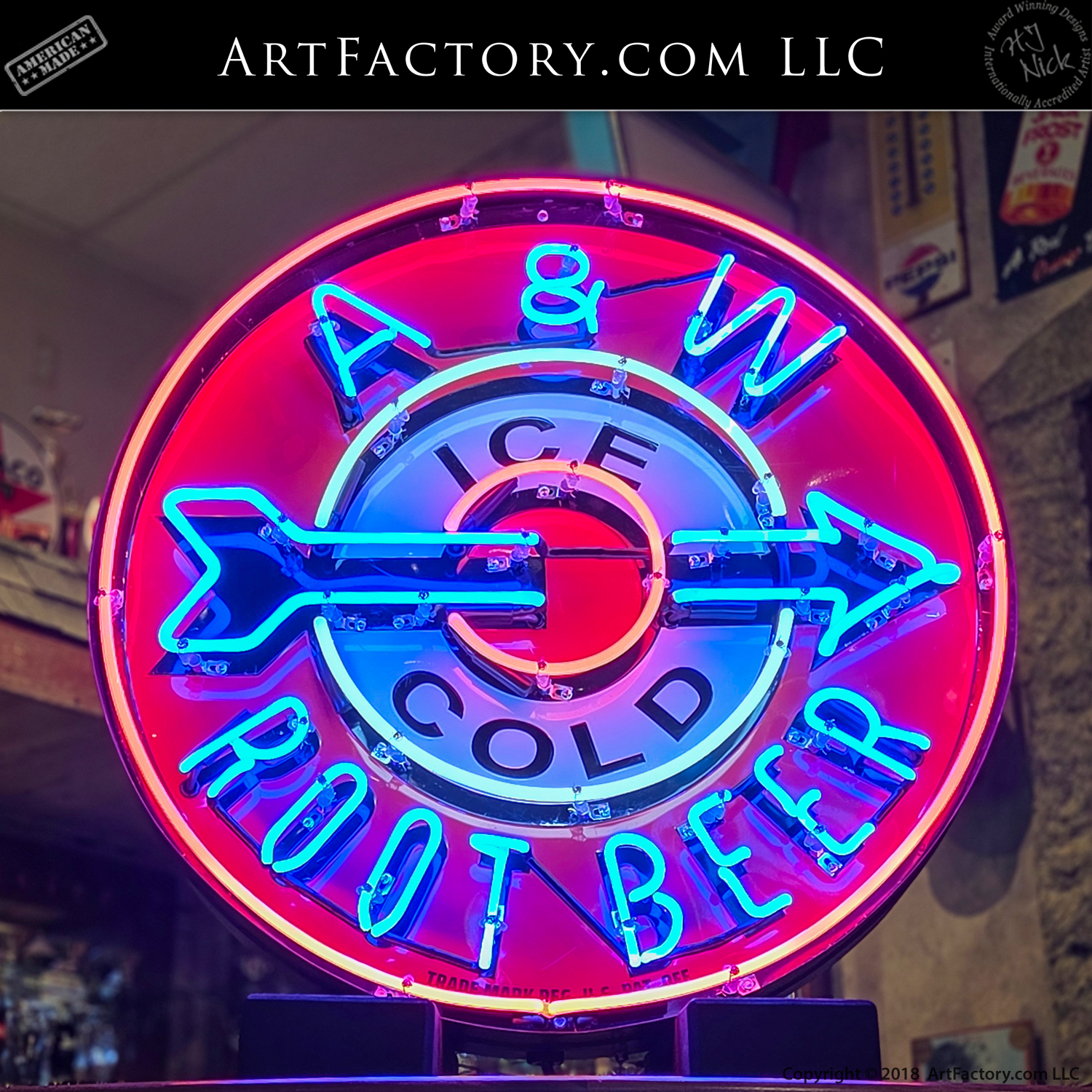
Then, through a shimmering wall of heat haze, the world changed.
It wasn't a building that appeared first, nor the silhouette of other cars. It was a glow—a concentrated circle of light floating in the desert blur. It was red like a steady heartbeat and blue like the deepest, coldest mountain water.
“A&W – Ice Cold Root Beer” 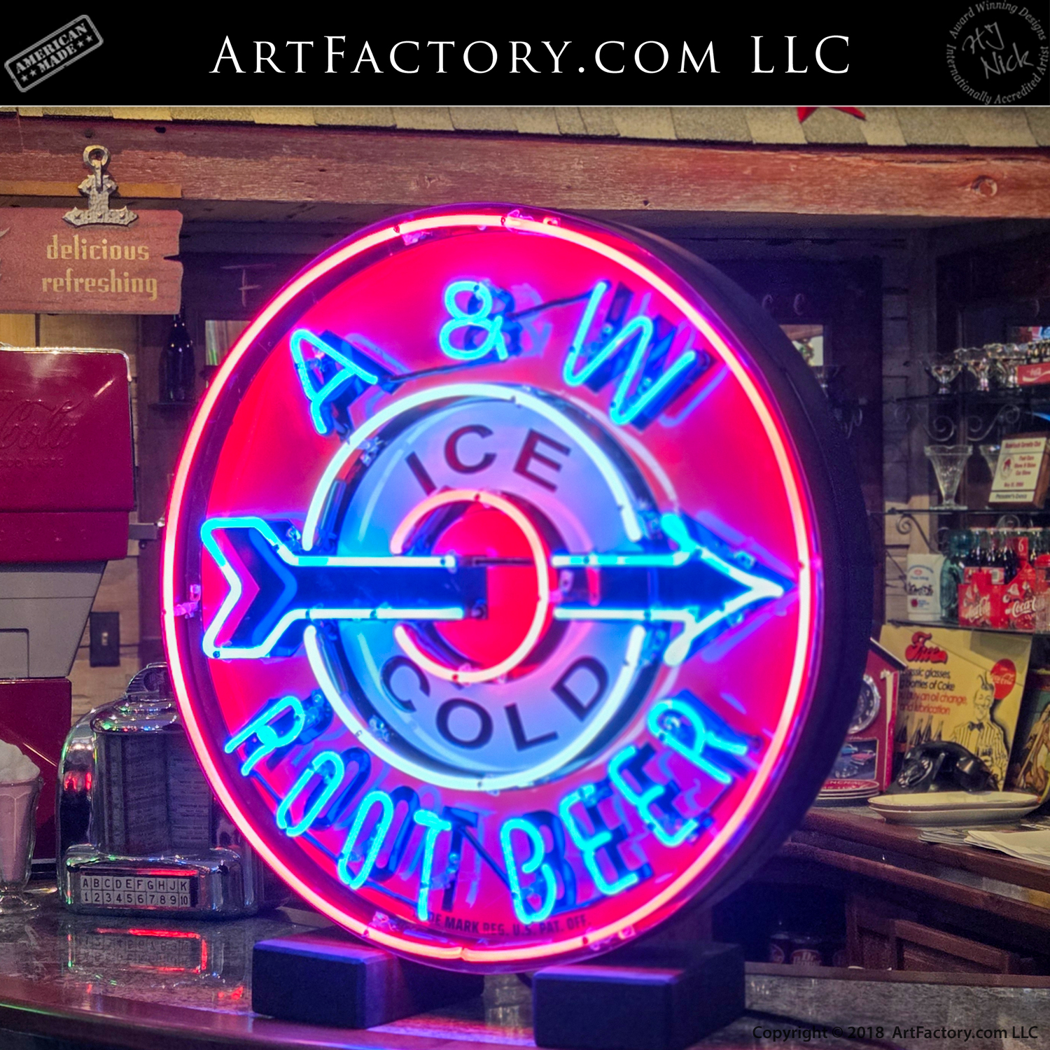
Piercing the center was an arrow, glowing with a conviction that felt personal. It wasn’t merely pointing to a roadside stand; it was pointing to a way out of the heat.
The driver pulled in, the gravel crunching under tires that felt like they might melt. As the engine ticked itself into a strained silence, the violence of the road faded. The world slowed down to the sound of a screen door slamming and the divine music of ice hitting glass. Above it all, the sign hummed—a low, electric vibration that felt like a promise kept.
You didn't need to read the words to understand the message. In the summer of ’64, that neon wasn't just selling a drink. It was a beacon telling every exhausted traveler: “You made it this far. Sit down. Cool off. You’re still alive.”
History of the A&W "Bullseye Arrow"
Neon Sign
The Era of the "Mother Road" (1950s–1960s)
This specific style of sign represents the "Golden Age" of Route 66, roughly spanning from the late 1950s to the mid-1960s. During this time, the American highway system was the primary artery for tourism and migration. Competition for the eyes of motorists traveling at 60 mph was fierce. Brands like A&W utilized "spectacular" signage—large-scale, high-contrast neon—to act as visual magnets.
Design & Visual Language
-
The Bullseye: The circular "bullseye" design was a psychological masterstroke. In a landscape of horizontal horizons and vertical cacti, the circle stands out as an intentional, man-made target.
-
The Arrow: The "encroaching" arrow was a staple of Googie architecture and mid-century design. It created a sense of motion and direction, literally "pulling" the driver off the highway and into the parking lot.
-
Color Psychology: The use of high-output Neon Red (neon gas) and Argon Blue (argon/mercury mix) provided maximum visibility at night and a vibrant, "frosty" contrast during the harsh daylight hours.
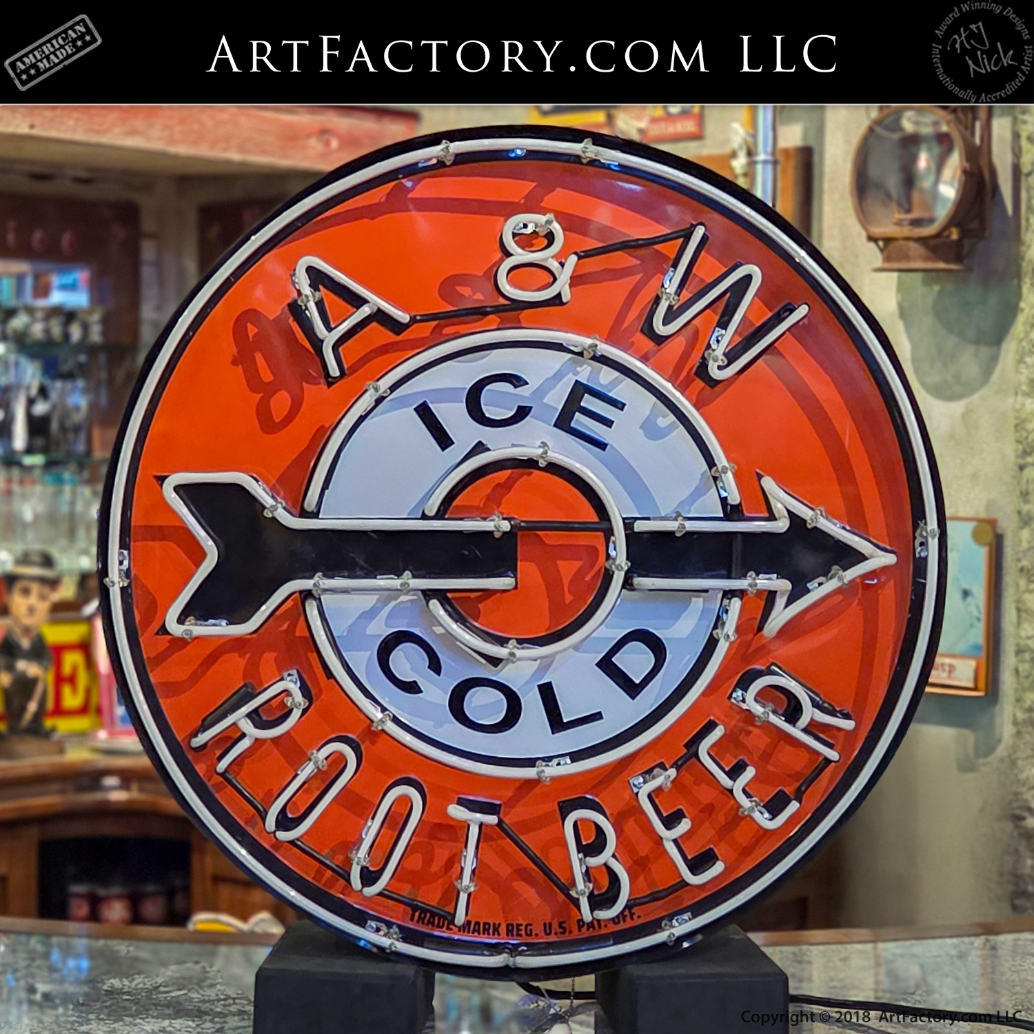
Materiality: Porcelain Steel
Before the industry shifted to cheaper vacuum-formed plastics in the late 1960s, these signs were built to endure. The faces were made of porcelain enamel on steel. This process involved fusing powdered glass to a steel base at temperatures exceeding 1500°F. The result was a finish that was virtually immune to the sun-fading and sand-blasting effects of the Arizona and California deserts—which is why original examples can still be restored to a mirror-like shine today.
The Transition to Standardization
The "Bullseye Arrow" signs are particularly prized by collectors because they represent the Early Franchise Era. By the late 1960s, A&W (and most major chains) moved toward corporate standardization—flatter, more uniform signage that was cheaper to mass-produce and maintain. The dimensional, hand-bent neon versions like this one became relics of a time when every roadside stop was an individual work of
commercial art.
Technical Legacy
Authentic pieces from the 1960–1964 period are identified by:
-
Dimensionality: The "can" or housing has significant depth, often 8–12 inches.
-
Hand-Fired Glass: No two neon patterns were identical, as each was hand-bent by
a master glassblower. -
Noble Gas Purity: Original restorations focus on using the correct gas mixtures to replicate the specific "glow" that defined the 1964 roadside experience.
Watch Neon Signs Restorations Video
Watch Hanging Neon Signs Video
Info Box
Enter description text here. Lorem ipsum dolor sit amet, consectetur adipiscing. Quo incidunt ullamco.
Reviews
There are no reviews yet.